
Sankey Charts
So what is a Sankey Diagram? And I don't mean the suburb of Warrington in Cheshire.

Sankey diagrams are a specific type of flow diagram, in which the width of the line is shown proportionally to the flow quantity. They are typically used to visualize energy or material or cost transfers between processes. It is sometimes also known as an Alluvial Diagram or Flow Chart.

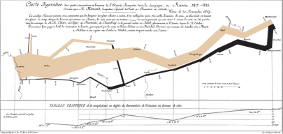
The frst example is from Minard, who was a pioneer of the use of graphics in engineering and statistics. He is famous for his Carte figurative des pertes successives en hommes de l'Armée Française dans la campagne de Russie 1812-1813, a flow map published in 1869 on the subject of Napoleon's disastrous Russian campaign of 1812.

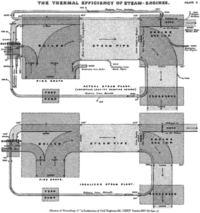
If Minard created Sankey charts why are they not called “Minard charts”? well Sankey diagrams are named after a former military engineer Captain Matthew Sankey, who wanted to show the flow of thermal efficiency around a steam engine in 1898.
Anyway, enough of History, what is a Sankey?:
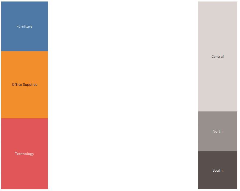
If you want to show how a value (or a measure) is split by a category (or dimension) and compare that same value split by a different category normally you would use two bar charts, possibly stacked, but it does not show how one category relates to the other.
So, to the solution? Draw lines leading from one dimension to the other, the size of the line is proportional to the split between each dimension on one side and the dimensions on the other side.
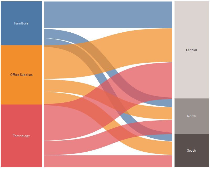
The chart now shows the flow of office category sales by region.
So how to create a Sankey Diagram in Tableau?

Well, like most things in life it is not easy or straight-forward, a blog from Jeffrey A. Shaffer from the Data Science Group shows how to produce Sankey Diagrams in Tableau, but don't be put off by Jeffrey A. Shaffer's complex macro’s and formula’s.
Simply you use stacked bar charts to create each of the layers, with line charts in between for the curved flows. The important part of this is to divide your y axis of the line cart into a proportional number you can create curved lines from, you will need to do this before connecting the data in Tableau (this is easy in Alteryx if you have that, but can be done in Excel) by creating 100 lines, each line represents 1% of the stacked bar, but to do this you will likely need to round your values to 1%, the x axis is 1 to 49 (to give you enough points to make a curve). This does mean you have to exponentially increase the number of rows per line by 49 (for example 100*49 = 4900 rows) you then use a "t" value (between -6 and 6 divided equally across the 49 rows) and a sigmoid function (1/(1+EXP(1)^-[t])) to create the curve in each line, once added together you get the look of flows from one position to the second position.
The biggest challenge is getting the stacked bars and the line charts to actually line up, the line charts are actually a subset of the data that is > 0.5% as any amount smaller that this will be rounded out and not be represented by a line. this means that the value of the stacked bars each side bars if you use the original unrounded values do not match the sum of the lines, this can mean they actually don't line up on the chart. To get around this you can use the rounded values to build your stacked bars but display the original values, but obviously they no longer are exactly proportional to the values. Alternatively, you can round your values to a smaller percentage (say 0.1% or 1000 lines) but this will make your data set bigger and if using Excel, a lot more preparation work.

An alternative is to use Chris Love’s method (as I have above, although the Tableau interface has changed somewhat since version 8 in Chris' blog) which uses Bins in tableau to create the lines. This is much easier and requires much less data preparation however, Sizing of the lines is fiddly and if there is a wide disparity between line values Tableau sizing is not able to cope (for example a line with a value of 2m and another line of just 2) and you cannot use the full -6 to 6 widths of the x axis meaning that the lines do not exactly line up with the stack bar.
Both of the methods are great but come with limitations. The two-main limitation are the rounding of the values leading to data loss or warping of the proportional pixel size of the lines compared to the actual value and dealing with negative values which we will come to next.
Neither of these methods addresses negative values. When working with financial data and wanting to show the “flow” of money negative values are common (Credits and Debits). Negative values with throw you stacked bars out…it is likely that the pixel height of each bar will be different and the lines will no longer line up at all. There are two ways to manage this. One is to exclude the negative values (although clearly this filters out part of the data set) or to absolute the values (i.e. convert the negative values to positive) leading to potential confusion and the need for clearer labelling.
When does a Sankey makes sense to use?
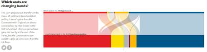
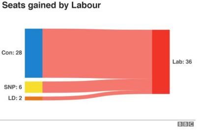
The best use of Sankey’s I have seen are when you have a limited value (measure) to dimension (Category) ratio. Seats in government is good example where the ratios cannot be too diverse and the max value will be in the hundreds rather than millions and the totals will be fixed and alway possitive numbers between catagoies.
Two examples from the Guardian and BBC respectively.
Here is my own interactive version of the UK Election 2017 using the Jeffrey Shaffer method

So you will either love Sankey Diagrams or will hate them. Some people find them hard to read, but personally I love them and think they are a chart type that can be beautiful and informative.