
Tables
In the community of data visualisation tables or crosstabs have a bad reputation and should be avoided. But working for a bank I find that users of my dashboards and reports specifically ask for a table and it’s almost as if they don’t believe the numbers in the dashboard unless there is a table on the page showing the numbers in black and white. This has intrigued me, so this blog is my attempt to explore the concept of tables in more detail and understand what the attraction to them is.

So, first of all let’s look at the history of tables according to Wikipedia the word table comes from “medieval counting houses, the tables were covered with a piece of checked cloth, to count money”

But it seems that the first table originated over 2 thousand years ago. “Quintus Valerius Soranus (d. 82 B.C.) was the first author to provide a table of contents to help readers navigate a lengthy work.”
Another well know historical use of a table is the periodic table:
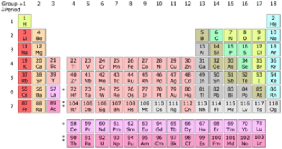
“The Russian chemist Dmitri Mendeleev published the first widely recognized periodic table in 1869. He developed his table to illustrate periodic trends in the properties of the then-known elements.”
We should consult the authorities on Data Visualisation. To see what is “best practise” in table use.
Stephen Few suggests: “A table works best when it is used to look up individual values and [or] the values must be expressed precisely”
Taking this further I would say that this means that if you are attempting to compare values the using a table is bad and a graph that allows comparison would be better.
Edward Tufte seems to agree: “Small, noncomparative, highly labelled data sets usually belong in tables.”
Tufte also suggests that “too often when we create a data table, we imprison our data behind a wall of grid lines. Instead we can let the data itself form the structure that aids readability by making better use of alignment and whitespace.”
Here Tufte is not saying do not use tables, but rather that the table design itself should not distract from the communication of the data to the reader.

Alberto Cairo says “Extracting meaning from and table is tough. Can you see any interesting trends just by reading the figures? If you can, congratulations. You have an extraordinary memory. Most of us mortals have brains that didn’t evolve to deal with large amounts of data”

In Andy Kirk’s data visualisation book, he states: “Through tables we can look [Kirk’s italics] at the values contained to precisely read them as individual data points. We can look up values quite efficiently, scanning across many variables for the difference records held. However, we cannot easily establish the comparative size and relationship between multiple data points”
Cotgreave, Shaffer and Wexler in their book The Big Book of Dashboards think “Sometimes you do need to be able to look up exact values. A table is an acceptable way to show data in that situation.”
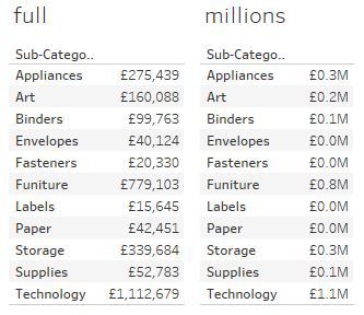
However, my own experience with exact values has taught me to be careful, as rounding of figures can lead to inaccurate values being shown. For example, values shown in millions to one decimal place will be shown as 0.0 if under 50 thousand.
David McCandless doesn’t mention tables and certainly doesn’t have any in his books, which leads me to assume that he thinks that they have no value to him in communicating data visually and the nearest he gets to a table is the coffee table his books usually sit on. What is interesting, is that he may think that tables are not beautiful, but I think the simplicity of a table can have it's own beauty.
So back to basics, what is a table?
Wikipedia describes a table as “A table is an arrangement of data in rows and columns, or possibly in a more complex structure.”
The Oxford English Dictionary describes Tables as:
“A set of facts or figures systematically displayed, especially in columns.
‘the population has grown, as shown in table 1’
A list of rivals or competitors showing their positions relative to one another; a league table. ‘the team's slide down the First Division table’
Multiplication tables. ‘children at the school have spelling tests and learn their tables’
Computing. A collection of data stored in memory as a series of records, each defined by a unique key stored with it.”
Tables are everywhere.
Train time tables, calendars, contents of a book, even when you make a shopping or to do list this is a simple table of one column. Take the Bus Time table below.
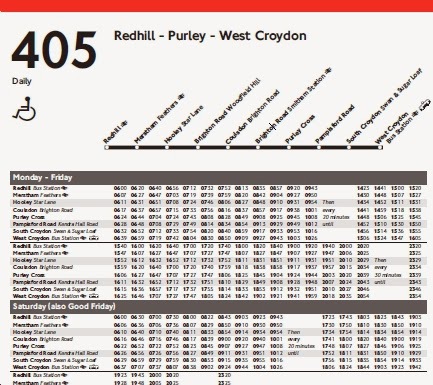
Now this is actually quite a complex set of information that the bus operator is trying to convey. The user (or passenger) has to work out where they are, where is the bus stop near their destination location, work back from the time they need to be at that destination location back to when they need to be at the starting bus stop for the journey.
But it is expected that everyone in society will understand the table and be able to make it to their destination on time (assuming the bus is on time that is!)
This format (above) must work as it is clearly used all across the world,

but some operators have experimented with alternatives to simplify the effort the passenger has to go through, although this often still results in a table.
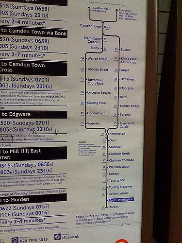
The London underground has also experimented with alternative using a time line graph in conjunction with simple tables.
A quick way to turn a table in to visual chart is the use of highlight tables. Or as Shaffer, Wexler and Cotgreave suggest “Adding a colour encoding to your tables can transform them into highly visual views that also enable exact look up of any value.”

For example, the same table just with added colour makes a massive difference.
This use of colour makes it much easier to pick out the relative differences in values within the table, instantly making Technology in the central region stand out.
But there are examples where a very creative reinterpretation of a very traditional table can make a massive difference. Thus, providing the same if not more information in the same pixel space on screen but allowing the reader to find what the information more quickly and instinctively.
Take a traditional sports league table as shown by the BBC:
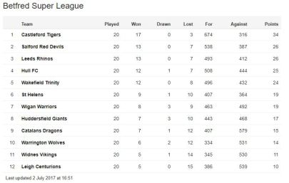
Now as tables go this is not that bad, there is good ink to data ration with no unnecessary black lines or banded shading.

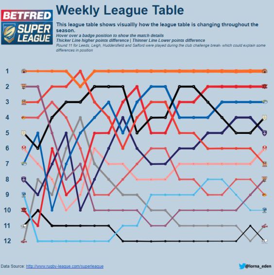
But this can be much better as Lorna Eden shows with her excellent weekly league table (which isn’t a table, but a bump chart).
This shows all the same information, but also shows it for every round played in the league, so that trands and timescale also come into the mix.
Now I mainly use Tableau for data visualisation and so what does Tableau make of Tables?
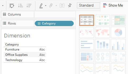
If you double click on a dimension on a new worksheet this is what happens.
It automatically creates a table (or “Text table” as Tableau call it) even telling you it is a table with the “show me” tool, which has tables as the very first chart type in the top left prominent position.
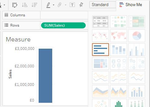
However, if you double click on a measure you get a very different result.
Tableau clearly must think that qualitive data types (dimensions) will need to be listed in a table (at least initially) while quantitative data can be put straight into a visual chart type (a bar Chart).
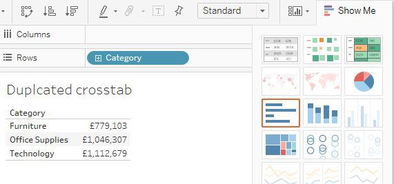
But Tableau also has a “Duplicate as a Crosstab” function which again hints at tables being at the heart of data visualisation or at least data exploration.
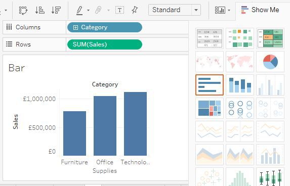
Becomes:

A study by Aner Tal and Brian Wansink At Cornell university suggests that many people don’t really read the numbers when looking at table or numbers in text, but cannot avoid the relative size of Bar chart, increasing the persuasiveness of whatever argument the author is trying to get across.
Maybe this is linked to the idea of believing the numbers. Charts can be manipulated the relative comparison as well as making it more obvious, leading to a culture of cynicism of charts particularly in media where bias is a major part of journalistic story telling.
Working for a bank there is also a large reliance on Excel within the organisation, where pivot tables are the primary data analytics tool used and financial data tends to be produced by in an accounting format. So are used to seeing tables and quickly analysing them
I have also noticed that this quick analysis of tables and being able to pull out your own outliers are used by managers that perhaps the presenters of the data may not have noticed to disrupt and undermine that presentation. Senior managers also use this skill to make themselves seem superior to the mere mortals that do not have a photo graphic memory or have not homed their table reading skills.
But it is just as easy to “hide” numbers in a table…especially if it is a large table with many columns and rows that may scroll off the screen.
So, in conclusion - Are Tables bad? To quote Andy Cotgreave “It Depends” springs to mind. Tables have been used by humans for at least two thousand years so they must work and they have their place on dashboards.
However, they should be used with caution if your user or consumer of the data require exact values, but try and keep the number of columns and rows to a minimum and be careful of rounding.
Perhaps even going to the extreme of this with the use of BANs (Big Ass Numbers) which are effectively tables with only one value in large font and axis hidden, but highly effective as getting the message across.
Basically, if the audience is only going to get a short amount of time to view the data such as in a presentation or a much larger dashboard then they should be avoided. When you do use them keep the table to a minimum of rows and columns.